Horror,

This screen shot represents the genre, which is horror as the text has a glow affect around it and looks like it has been hand written, which gives the audience a sense of realism.
The back ground is black which has connotations of death or evil and the text is white which stands out to the audience. As it has the glow affect it makes the film trailer seem more spooky and mysterious.
Here is a close up of the killer. This is used to show the audience the facial expressions of the killer and how evil the killer looks. This pulls the audience interest into the film and tells the audience what genre the film is which is horror. The killer looks slimy and has big teeth that indicate that this film will have some kind of killing going on. The killer is clearly shown to be some thing out of the ordinary and this can attract the target audience. It has dark lighting such as black and a dark greenish colour which represents the darkness and evil in the killer.

The music at this stage in the trailer is slow and tense that builds up the tension and makes the audience more gripped to the story line.
Here it shows the audience what the killer looks like. To make the killer look more scary smoke has been added at the bottom to make the killer look more deadly.
The composition of the killer tells us that he is strong and evil due to the long shot at a low angle used to show the audience what he looks like. The camera is looking up at the killer to show he has power and is strong.
 Jeepers Creepers is a well known film, which has two pervious films, so this film trailer has an advantage of appealing to its audience because it is already known for being a horror film trailer, and already has a fan base, so people know what to expect. The symbolic codes around the colour of the title are death, evil and blood, this is because the colours are red but with white as well that could mean that there is good characters as well. The fact that there is a number 3 in the title tells the audience that this is the next film made. The title is not in a straight line. Its letters are different sizes and look spooky. In the trailer is has a back ground song which talks about Jeepers Creepers, so the song has been linked to the title, which shows that the killer is creepy.
Adventure,
Pirates of the Caribbean
Pirates of the Caribbean is an historical adventure film. This is shown by the long shot used to show the audience the location and the customs that are worn. The use of the long shot shows the audience big room, the big paintings on the walls and the gold colours on the cloth on the table. This represents the wealthy characters in the film and this is easily noticeable to the audience.
The music used at this moment is starting to get faster and this keeps the audiences attention.
There is also a voice over used and it says, ‘oh Jack Sparrow’ then the camera looks at the character Jack, this shows the audience what the character is called.

This shot shows the codes and conventions of adventure as it shows a fight happening on a ship.
The music used here is fast and dramatic which is getting faster and pulling the audience in. the lighting here is dark which represents the period of time it is set in. This is because back then they did not have electricity so would have used candles. But it could also be dark due to the time of day it is, which is night time.
There are loads of binary opposites taking place in this film trailer, which are day vs night, bad vs evil.

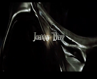
This film trailer puts the actor’s names in it as they are well known and will bring more of an audience in as these actors will already have a fan base.
Johnny Depp has been in the pervious Pirates of the Caribbean films and is known for being the funny character. The lighting is dark and grey which could represent that there is more to this character. His name is in white with a glow in the middle of it which is using the codes and conventions of adventure as the glow could represent the adventure in the character.
The music has a sort of heroic deep and fast sound to it which builds up the interest within the audience. As this is a way of advertisement, it uses assumptions that the audience will appeal to this music and therefore pull a wider audience in.

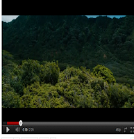
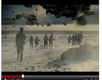
Here is a long shot to show the audience the location. It shows that the characters are on an adventure, and this clearly shows the genre of the film. The film is about pirates, hence the reason why the title has ‘pirates’ in it. The compositions of the characters are on the bank and the camera is looking over at them, which is telling the audience what the genre of the film is, which is adventure. This is due to the location.
The music helps build that idea of adventure as the music is starting to get faster and there is a voice over that say’s ‘you could guide an expedition’ this is said as soon as this part is shown, so it is basically telling the audience what is going to happen, but not giving to many clues away, but teasing the audience.
Action
The Expendables
The army trucks represent the genre of The Expendables. This is because it is showing that there will be some kind of action going on. The lighting used here are mainly dark colours that could represent the bad that is going on. This shot uses a long shot to enable the audience to see what is going on, and due to the army trucks and the castle, it will pull the audiences interest in and ask them selves what is going on.
The music that is playing in this part is dramatic but at the same time it has a seriousness sound to it. This is a common sound that can be related to action films.

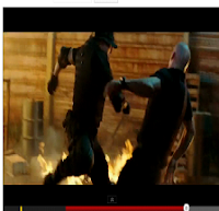
This shot represent the genre, action. This is because it is showing the traditional ‘ass kicking’ that is usually seen in action film. The fire behind, lights
It up and the brightness from the flames and the dark colours (black) could represent a good vs bad fight.
The music used here is a like a rock type of music that is loud and fast, which follows the narrative of action, as it could be representing the fastness of the fight.

“They are the world’s greatest mercenaries. The only life they’ve ever known is war. The only loyalty they’ve ever had is to each other” this is what the voice over says at the start of the trailer. It ends with a rock song and sound effects of knives, guns, military vehicles and explosions. This is in between the rock music that is linked to the narrative of action.
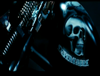
The close up image of the skull could be linked to the fact there is a motorbike and the fact that the music is rock, could represent a hard life that the characters live, having that type of action packed life style. ‘Expendables’ is the logo these characters have and it represents the job they have, which is to kill people.

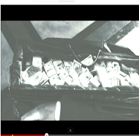
In this medium shot of the money the genre is well presented as in most action films, you tend to find that a large amount of money if involved. This tells the audience that some thing bad must be going to happen to have that amount of money. The bag its self just looks a bit suspicious. Just after this the characters are shown and these characters are well known to be in action films and ‘ass kicking’ for instance, Arnold Schwarzenegger, Sylvester Stallone, Jet Li, Bruce Willis and many more. This pulls in a wider audience as there are many well known famous actors that are known for action films.
Sci-Fi
This shot shows how epic Humanity’s End is. Its representing its genre, Sci-Fi due to the space ships in the sky, and the beam of light in the centre of the shot. The colours used have a warming feel to it as the colours are browns and dark yellow/orange. The dark colours could represent the bad starting to come but the light colours could represent that there is goddness waiting to defeat the badness.
The sound used at this part audience interested because it is making them think what is going to happen. of the trailer has a sound to it as of to say that some thing is coming, this keeps the
This shot uses dull colours such as grey and black which represents that the baddies have taken over. This shot also shows the science in the film as there is some kind of platform or floating in the air.
The music here is loud and builds up the tension and pulls the audience in. It gives a feeling that something epic is going to happen, which follows the genre of Sci-Fi
This long shot enables the audience to see the action which is going on. It uses dark colours such as black and greys to represent the evil or badness that is taking over, but at the same time there is an explosion which is white, this represents the good characters fighting back.
The shot clearly follows the genre of science. This is due to the alien ships flying around in the sky and a huge explosion. These features are things we expect to see in Sci-Fi films.

At this part of the trailer, a voice over is used, ‘a dark force is risen to bring an end to humanity’ this is linked to the title of the film, Humanity’s End. The image shown indicates to the audience that some kind of alien is going to take over the human race, and the images also follow the genre of Sci-Fi as there are ‘out of this world’ aliens with guns.
The compositions of the characters are running towards the camera so this could represent that they are coming to take over.
The music used here has a loud but deep base to it which builds up the audience’s interest and keeps them gripped to the action. This follows the narrative of Sci-Fi as it uses the tense music when the aliens are on screen.
From analysing different genres of film trailers it has helped me to know what codes and conventions to use to make a successful film trailer. It has also enabled me to use the appropriate camera shots, music and colours to use in my film trailer to represent the genre I am doing.


